8.24.2010

One of those days

that just couldn't end quick enough.
I hate the beginnings.

8.21.2010

It's been a pink weekend


Bearded man! This is where the swirly lines really took hold, i liked their effect and wanted to do it on a larger scale which led to the Chekov spreads. I like how he looks like he was aiming for princess leia after a few drinks so the buns have ever so slightly slipped down his head. What a man. I'm really happy with how this came out! A more productive form of procrastination, but procrastination non the less. I realllllllly need to sort my act out and get this v&a stuff done.

Anton Chekov


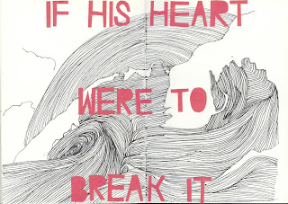
I'm not too good with colour in my illustrations and have recently found that using coloured typography instead of my standard black outline really lifts the image. This is Chekov quote that stuck a chord with me and i just thought it evoked such rich imagery. I wanted to play around with a different technique than my standard black outline so tried out the waves by filling then with lines of varying thickness to show the different tones.

Jared


The picture's a bit faint but thats probably because it's in pencil. I'm in my drawing mood today and above is the beginnings of a sketch of Jemaine Clement as Jared in Eagle vs Shark dressed as an Eagle. I'll fill in the rest then start on Lily as a shark.

8.17.2010


Pictures

LOOK AT MY PICTURES HERE:

8.13.2010

V&A

I've been doing bits and bobs at the V&A since early July and while taking part in a workshop one sunday (the 18th i think it was?) i noticed this AMAZING new feature in the tunnel just outside the arch entrance to the museum. Design by Troika and installed probably in the second week of July, "Pallidrome" is a kinetic sign with 3 individual pieces that continually revolve to deconstruct and reconstruct the infamous V&A logo. For the logo in motion:

8.12.2010

PERSEID METEOR SHOWER


TONIGHT! i will stay up, i will.

8.03.2010

Nothing of any importance


I just thought my hair looked quite friendly. Also the lovely jubbly map i bought from the Magnificent maps exhibition at the British Library on the 23rd is flattening nicely after being horrifically squashed in my bag (if you haven't been GO! it's on until september although i do warn, you do get a bit mapped out towards the end.) It's the octopus map but Fred W Rose, but looks more blue than this one. Definitely one of my favourites from the show along with Grayson Perry, Steven Walker's The Island and the gorgeous terrestrial globes.