Showing posts with label illustration. Show all posts

5.02.2013

SibleyGrove Christmas Cards 2012


Update to the company's website with the cards I designed for them last year - more photos here. 

12.23.2011

Decorative Jargon


I really enjoy doing labour intensive work, that almost makes me feel
like i'm going to go blind i have to concentrate so much.


The above work is part of my self-directed work on medical quackery and spin.
although what i've done so far seems to be what other people have told me to
do and, by going through the motions, i've lost a sense of WHY i wanted to do it.

By highlighting elements of serious side effects which are tucked away in the
DECORATIVE JARGON of small print in medical leaflets that are designed to be
as offputting to read as possible thus disguising potential hazards of painkillers
like nurofen which can result in heart attack or stroke // infertility in women.

Suffice to say after looking at it properly, the top type size on each is too
small to be properly legible (or communicate what it's supposed to...effectively
the point of my degree....) and the bottom of the first can only be [sort of] read
if small or far away. and that the fact that the one legible one is off centre.


Hopefully i'll be putting more work up here soon!

here's hoping though.

I seem to be trying my damndest to fail this year.
And by that i mean this dissertation is trying to kill me.


9.07.2011

I started drawing again


A bit sad that this is the first proper work post
after loads of youtube videos.

I like how the mask looks like the little boy's (a bit?) below.


6.01.2011

YCN Student Awards- Fedrigoni Brief


I don't think i put these on here after i finished it, which was just over 2 months ago. Put into practice my interest in materials and processes... although it wouldn't be a bad thing if i didn't screenprint for a while. OH that was a stressful day.


5.12.2011

Human Memory


This actually does relate to my work.
And i'm almost certain i cut an illustration like this
out from a magazine when i was in primary school.

Now to find it.


3.09.2011

Work in Progress


Slowly but surely


i'm quite proud of being finally able to use illustrator now. Although the tv took about 5 hours. How much does it not look like it took that long?

1.14.2011

Inez van Lamsweerde + Vinoodh Matadin


Inez & Vinoodh are one of my faves and i love the concept for this shoot. could adapt this for collaboration (what do you think dulcie?)

1.08.2011

Funny Face


My favourite is the third from the top. Continuation from this post

11.12.2010

i really like


raymond pettibon

11.02.2010

en tu tre


i know they're not the best examples of screenprinting but i'm haps.

Staehle's Revenge

How i only wish i could do something as good as Wilhelm Staehle...


10.31.2010

9.23.2010

Edward Lear


I found the most incredible book yesterday at the Southbank book market (Edward Lear's Nonsense Omnibus) full of gems and gorgeous little drawings but put it back because i thought it's £7.50 price tag was too hefty for my pockets. Really regretting not getting it now. As i knew i would...


http://www.belz.net/teaching/edward_lear.html

8.21.2010

It's been a pink weekend


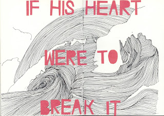
Bearded man! This is where the swirly lines really took hold, i liked their effect and wanted to do it on a larger scale which led to the Chekov spreads. I like how he looks like he was aiming for princess leia after a few drinks so the buns have ever so slightly slipped down his head. What a man. I'm really happy with how this came out! A more productive form of procrastination, but procrastination non the less. I realllllllly need to sort my act out and get this v&a stuff done.

Anton Chekov


I'm not too good with colour in my illustrations and have recently found that using coloured typography instead of my standard black outline really lifts the image. This is Chekov quote that stuck a chord with me and i just thought it evoked such rich imagery. I wanted to play around with a different technique than my standard black outline so tried out the waves by filling then with lines of varying thickness to show the different tones.

Jared


The picture's a bit faint but thats probably because it's in pencil. I'm in my drawing mood today and above is the beginnings of a sketch of Jemaine Clement as Jared in Eagle vs Shark dressed as an Eagle. I'll fill in the rest then start on Lily as a shark.

7.24.2010

\/ + /\


This was my entry for the image for the V&A website. i really like it and it's really similar to the chintzy cheeriness on i posted a little while ago from my sketchbook. I didn't win but i'm to do an identity for the CreateVoice scheme instead! pressure pressure pressure

7.15.2010

Skejbook


As i said in one of my older posts, i started a personal sketchbook for proper about a month or so ago. I was pretty avid for the first week doing a double page drawing every day but they were a bit uneconomical time-wise mainly because i spent a long time thinking what to draw. But i felt i really needed to draw and it was nice practice in committing to something and actually doing it.

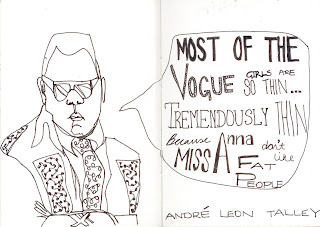
I did some drawings at the huntarian last wednesday before meeting a friend (avec the decapitated foot) and have since started a project drawing people i like and a quote they said. I'm aware they're all men for now, but i have some lady treats up my sleeve. Just you wait.

7.09.2010

Technology. Fail.

I just sent some stuff off to the V&A for an image competition for their website... literally everything that could go wrong did (no internet, broken scanner, mac going mental with the scanner and refusing to work) and i've ended up sending the stuff 40 minutes late and massive sizes.


could i possibly make a worse impression?

7.02.2010

62.


I've been reading John Betjeman a lot recently.