Showing posts with label line drawings. Show all posts

7.05.2011

“I had my freedom and that was nice”


an exhibit of twombly (and Poussin's) work at the
Dulwich Picture Gallery has just started


lot's of interesting things on cy twombly here:

http://www.theartstory.org/artist-twombly-cy.htm


1.08.2011

Funny Face


My favourite is the third from the top. Continuation from this post

7.15.2010

Skejbook


As i said in one of my older posts, i started a personal sketchbook for proper about a month or so ago. I was pretty avid for the first week doing a double page drawing every day but they were a bit uneconomical time-wise mainly because i spent a long time thinking what to draw. But i felt i really needed to draw and it was nice practice in committing to something and actually doing it.

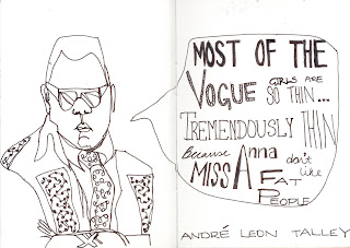
I did some drawings at the huntarian last wednesday before meeting a friend (avec the decapitated foot) and have since started a project drawing people i like and a quote they said. I'm aware they're all men for now, but i have some lady treats up my sleeve. Just you wait.

7.01.2010

61.


i haven't put any of my own work up for AGES so i thought i'd ease into it again with these scrawls (one of those drawing exercises that i LOVE where you draw continuous line without looking at the page). I am very fond of them, especially the hands... there were more but my mac doesn't like my scanner and keeps going wrong. poppycock! I think i'll start putting scans of my sketchbook on here once it (hopefully) starts working again.


2.06.2010

Geezer Romeo and Juliet

The first brief set for Design followed on from the summer project, in which we were allocated a character (mine was the 'Geezer') to research and then make a 24 page guide on.

We had to advertise Romeo and Juliet to this character/target audience. Inspired by a line drawing i did of two knuckles covered in various sovereign rings in my research, i settled on using the same bold & simple drawing depicting various themes evident in the play; love, brotherhood, fate, conflict and drew hand positions to convey these.

Deciding that conflict was the more effective visually i settled on using fists portraying violence. I played around with fonts and layering and was plesantly surprised by the physical layering effect of using cartridge paper, two sheets of accetate and coloured paper to show the high/low lights.

i eventually settled on black and white for the final as i thought they were more striking, redoing the 'CAPULET' fist so it was b&w like the 'MONTAGUE' one. the visual language seemed more punchy then. personally, i like how lo-tech and hand made they are as physically doing things myself is how i like it best, although i understand they're not to studio quality which is what we're supposed to aim for. But first project, eh! i like it.

photo quality is shocking, i am aware. i can always update later...

2.03.2010

I Met the Walrus


I saw this a couple of years ago on the culture show and was blown away.
It flows so nicely with the words and images seamlessly working together. there's no wonder that it was nominated for the oscar.

i would die happy if i could do anything remotely like this.