
footnote disease...hmmmmm, that's a bit weird.
5.26.2010
Footnotes
According to wikipedia, authors use footnotes "to escape the limitations imposed on the word count of various academic and legal texts which do not take into account footnotes. Aggressive use of this strategy can lead the text to be seen as affected by what some people call "footnote disease".
5.24.2010
Drawn a total blank


on how to write a conclusion right now. I'm all of a dither so that's not particularly helpful. Went to the printers who said they couldn't print on my paper (even though they most probably could) and that CS4 won't work for them so i have to go BACK later in the week to print all my shiz and i have loads of stuffs left to dooooooo. It's as if they know i have a deadline and just want to make it really hard for me.
On a brighter note, we made jelly with lemonade as the rowntree's advert said. It had better be good. Bombass and Parr are genii with jelly, making them into architectural delights and events like an architectural punchbowl and a scratch and sniff cinema. brilliant.
ohhh links links links. back to work i go...
5.23.2010
why oh why...

...does my cv and pdf combo look so baaaaaaaaaaaad. Actually no, I quite like it but i think i shouldn't because every page looks different.
I am, however, yielding to my penchant for bad taste and all things tack for my zine for the London Zine Symposium. Many bits flying around my head but hopefully i'll set them down tomorrow. Here's a cheeky teaser...
5.17.2010
Sexy People


I don't care if it's old news! I hadn't been on the Sexy People blog in a while and the few minutes of renewed joy it gave me, as im so so nearly at the end of my essay but really not, were invaluable.
i want to paste my walls with these beauties
Deadline
Less than two weeks until the deadline and end of my first year at Camberwell...and we've got builders in. nice one guys, nice one. although, to be fair, he's just been hanging out in his van reading the sun for an hour or so.
5.11.2010
NO NO NO
NICK CLEGG... don't do it. Conservatives won't love you like you want them to.
on a brighter note, my mac should be arriving tomorrow. huzzah!
on a brighter note, my mac should be arriving tomorrow. huzzah!
5.08.2010
Faber & Faber

I've got my eye on a delightful hardback set of 6 poetry classics Faber & Faber have released for their 80th birthday, including Sylvia Plath and John Betjeman, each with a cover and end-paper created by a different printmaker; Paul Catherall, Peter Lawrence, Joe McLaren, Clare Curtis, Heaney Nick Morley and Mark Hearld.
They're all absoloutly gorgeous and i love that F&F are promoting works by these amazing artists. Nicely enough, i've found an article covering this on the creative review website with individual close ups of some of the books and their end-papers to whet your appetites.
http://www.creativereview.co.uk/cr-blog/2009/april/fabers-80th-anniversary-poetry-covers
picture courtesy of design sponge
http://www.designspongeonline.com/2009/06/faber-poetry-covers.html
They're all absoloutly gorgeous and i love that F&F are promoting works by these amazing artists. Nicely enough, i've found an article covering this on the creative review website with individual close ups of some of the books and their end-papers to whet your appetites.
http://www.creativereview.co.uk/cr-blog/2009/april/fabers-80th-anniversary-poetry-covers
picture courtesy of design sponge
http://www.designspongeonline.com/2009/06/faber-poetry-covers.html
4.29.2010
James Houston
I saw this yesterday at 'Pick Me Up' at Somerset House as one of the videos shown in the It's Nice That cinema . So so so nice, it made my tummy do that nice swoopy thing like when you hear something beautiful (skip to 1:10 if you have no patience).
In his own words:
"Based on the lyric (and alternate title) "Big Ideas: Don't get any" I grouped together a collection of old redundant hardware, and placed them in a situation where they're trying their best to do something that they're not exactly designed to do, and not quite getting there." http://1o3o.tumblr.com/
In his own words:
"Based on the lyric (and alternate title) "Big Ideas: Don't get any" I grouped together a collection of old redundant hardware, and placed them in a situation where they're trying their best to do something that they're not exactly designed to do, and not quite getting there." http://1o3o.tumblr.com/
4.26.2010
Shoreditch wants to meet you


This is what i finished and printed last monday for the crit on tuesday. It went pretty well, only that i should try to change the main type to a gill related one and try it out on letterpress. For the "Live East London like a local brief", my idea was to promote the idea adopting language used in personal/lonely hearts adverts. I had three variations on copy, with each focusing on area around Columbia Road Market as i think this is the most fascinating part of Shoreditch; one for the area of Shoreditch as a whole, one focusing on the flower market and one for the venue ' The Flea Pit'. Most applicable to print, as most things i do: posters/ billboards/ flyers/teaser 'business cards'.


(these are the examples when modified)
i hate dogs
i feel a bit uncomfortable and at a bit of a loss. and increasingly nervous in case i get nearly attached by that twat of a dog. so this is what it has come to? great. and i could so nearly have got my mac today. what. the. fuck. what's a brother got to do? safe to say im in one of my moods again. Im listening to the Walkmen which although lovely, isn't really helping.
4.25.2010
Mr Bingo

Line drawings for 'tiny acts of rebellion'. I will get this book! This one's my favourite. His hair portraits are beautiful as well(including one for the mighty boosh, obviously). Best new find.
I also found this interview with him which is lovely: http://matandme.net/mr-bingo-new-age-illustrator
4.18.2010
Cover Versions
 While trawling through numerous websites to find inspiration for this seemingly neverending project i stumbled across these INCREDIBLE 'cover versions' of classic albums if they Pelican books in the 1960's by Littlepixel. They look so authentic and beaten up, and are simply delightful. The Strokes, Hup and Au Revoir Simone's are also favourites. Have a gander at Littlepixel's flickr:
4.17.2010
Department of eagles
i really really like Department of Eagles; Daniel Rossen from Grizzly Bear's side project in case you thought they sounded a bit familiar. Delightful cover of Elvis. I feel really ill.
4.16.2010
My Ideal Man...
"I could probably conform to your standards.
Naw. I like eating mayonnaise and peanut butter sandwiches in the rain, watching Barney Miller reruns, peeing on birds in the park and licking strangers on the subway; you eat beets raw, have climbed Kilimanjaro, and sweat freely and often. Must wear size five shoes."
Naw. I like eating mayonnaise and peanut butter sandwiches in the rain, watching Barney Miller reruns, peeing on birds in the park and licking strangers on the subway; you eat beets raw, have climbed Kilimanjaro, and sweat freely and often. Must wear size five shoes."
4.14.2010
A month later than planned....
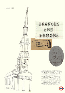
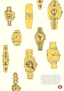
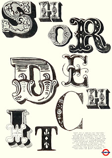 I finished my Shoreditch identity project! I used photoshop fully for the first time from thurdasy to tuesday last week.
 It was HORRIBLE. i was even reliving everything in my sleep for a whole week: zooming in and out, changing the background colour, shifting slightly left, slightly right. I now know why i like doing things by hand.... It was, however, very satisfying learning something and then forcing myself to use it. i can use photoshop! hurrahhhhh.
These are three posters, not too sure how i feel about them although the SHOREDITCH type one is my favourite. The book though. What a beast. I'm really happy with how it came out though. phew. over and out. 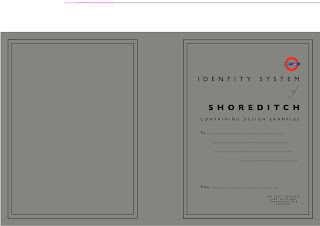
4.13.2010

New Finds
After perusing the internet for pretty much the whole of yesterday i found some lovely little titbits.
I want to live in Rennies Seaside Modern or buy up everything with pretend money to have in my pretend house. i would happily live amongst the delightful postcards and silken scarves and every single one of the old books. James Brown's Linoprints would also do VERY nicely. The one above is my favourite, taken from his website.
James Brown's Linoprints would also do VERY nicely. The one above is my favourite, taken from his website. 
Seb Lester is another absolute favourite. Some of his calligraphy stuff reminds me of Letman. Tits, Arse and Keep it Simple are my faves. Pictures all from his website. 
i heart
 Potential starting point for new project...due monday. Brilliant. Quite excited though.
 (picture from http://a-hole-in-the-head.blogspot.com/2007/07/something-for-males.html)
How nice is this?
I've been listening to it on spotify for the past few weeks now but this is the first time i've seen the video. the spinning tops! magic.
After freaking out a bit about the industry report, i put myself to work last night and this morning and sent out emails to 5 practitioners with my first response a couple of hours ago! what a nice man.
After freaking out a bit about the industry report, i put myself to work last night and this morning and sent out emails to 5 practitioners with my first response a couple of hours ago! what a nice man.
3.18.2010
Obscure Shoreditch


first post of work for a while. this is for a identity project for one of the stations on the soon to be opened east london line. my concept was based around the obscure stories throughout history on my chosen station, shoreditch; the 207 year old man, links between shoreditch church, shakespeare and the nursery rhyme 'oranges and lemons' and the fake/black market trade (focusing on watches). i like the photo but im a bit sick of this project to be honest. 5 weeks is a long time. hopefully a couple of days of not looking at it while allow me to look at it with fresh eyes allowing me to do something halfway decent with it.
i need to snap out of this yo. over and out.
Subscribe to:
Posts (Atom)

