
2.24.2010
Brain like a Sieve

Nothings happening. Its awful. I have a crit on friday where we have to show 5 objects/drawings/collages etc. based around the east london line. i've found out some really interesting facts around the area but the thing is that they all have to be based around ONLY ONE of the stations (haggerston, hoxton and dalston junction). All my potentials are spread around east.
I'm looking at artist's work and stuff hoping it'll trigger SOMETHING, but alas no. shit.
And what makes it worse is that this is the stuff that i love doing! Making stuff. Nicey fabric. Pretending im old. i don't want this to be shit, but i dont know what to do.
Probably about time to pour over the Art of Looking Sideways in the hope that something will happen.....
I'm looking at artist's work and stuff hoping it'll trigger SOMETHING, but alas no. shit.
And what makes it worse is that this is the stuff that i love doing! Making stuff. Nicey fabric. Pretending im old. i don't want this to be shit, but i dont know what to do.
Probably about time to pour over the Art of Looking Sideways in the hope that something will happen.....
Those little guys are the only thing pulling me through it seems.
2.07.2010
V&A Connecting the Collection


Our final work for the V&A promoting the museum to 16-24 year olds. To present to the marketing team on site at the Sackler Centre on the 12th. how exciting! Our idea was connecting the collection and linking objects from the permanent collection using 6' Degrees of Separation'. We did this by using continuous line drawings and connected text, further reinforced by flyers shaped like puzzle pieces. When fitted together the whole link is shown, details of
the objects are on the backs with room numbers and locations to
help guide the viewer around the museum to discover it for themselves.
I worked with the lovely Ferg, Rux and Angeli (who also deserves credits for the pictures).
2.06.2010


Geezer Romeo and Juliet
The first brief set for Design followed on from the summer project, in which we were allocated a character (mine was the 'Geezer') to research and then make a 24 page guide on.
We had to advertise Romeo and Juliet to this character/target audience. Inspired by a line drawing i did of two knuckles covered in various sovereign rings in my research, i settled on using the same bold & simple drawing depicting various themes evident in the play; love, brotherhood, fate, conflict and drew hand positions to convey these.

Deciding that conflict was the more effective visually i settled on using fists portraying violence. I played around with fonts and layering and was plesantly surprised by the physical layering effect of using cartridge paper, two sheets of accetate and coloured paper to show the high/low lights.


i eventually settled on black and white for the final as i thought they were more striking, redoing the 'CAPULET' fist so it was b&w like the 'MONTAGUE' one. the visual language seemed more punchy then. personally, i like how lo-tech and hand made they are as physically doing things myself is how i like it best, although i understand they're not to studio quality which is what we're supposed to aim for. But first project, eh! i like it.

photo quality is shocking, i am aware. i can always update later...
The Revolution Will Not Be Televised
.jpg)
My final A1 poster for the second project set at Camberwell.
The brief was to only use typography, strictly no imagery allowed, and one colour to depict 'The Revolution Will Not Be Televised' by Gil Scott Heron in an A1 poster (min 25 words) and a double page spread containing the whole poem. I wanted the imagery to be purely greyscale but by a happy accident there were highlights of purple when it went for printing which i thought set it off quite nicely (thankfully).
Insipred by the 'Tower of Babel' concrete poetry, i made jenga sized blocks initially in black outlines. I thought these looked pretty poor though so i filled them in black and put text around the blocks rather than just on the face. They were a beast to position though. Three different sessions because i wasn't happy with the photos. I threw things. And them. That's why they're a bit dented. oh well.
Drifter...
 i've misplaced my bloody phone and feel really lost. pathetic. i hate technology. if only paper cups and string were as effective...i would be SET FOR LIFE. fingers crossed its lurking somewhere in the macroom. i only wish this one worked in the meantime.

2.03.2010
I Met the Walrus
I saw this a couple of years ago on the culture show and was blown away.
It flows so nicely with the words and images seamlessly working together. there's no wonder that it was nominated for the oscar.
i would die happy if i could do anything remotely like this.
The Epic of Gilgamesh or The Unnameable Little Broom
I saw this on Sky Arts a few days ago and thought it was the best thing i'd seen in ages. I found it really hypnotising. And the organ that swells every so often makes it so chillingly lovely.
The Art of Looking Sideways
I got this lovely gem of a book for christmas and am still only a pitiful 35 pages into it.
Huntarian

I really want to go see this exhibition on at the Huntarian called the Craft of Microscopy. It's a mix of craft and technology with really beautiful photography. And its free!
1.21.2010
The Amazing Felix Thorn
I saw this at Gasworks at the end of 2008 and was mesmerised by the complexity of the work. Amazing.
1.20.2010
Wee Gee


i physically cannot seem to do work. so i'm looking at beautiful photographs instead. enjoy.

1.16.2010
Flora

I took this in Barcelona. I find this woman so fascinating mainly because it's a bit of an "is she there or isnt she". She looks so sad; maybe dressing up in leaves everyday does that to a woman. What makes it more magical is that i only saw her that one day. I wonder where she disappeared to...
1.14.2010
i found some pictures of foundation work...


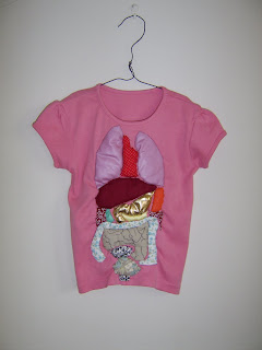


...that i took for my portfolio for camberwell last year
and i really really miss just making stuff. Literally doing something craft or textiles based to fit into pretty much every brief. I just want to do something really self indulgent.
It's probably due to the V&A project i'm doing now, staring at textiles on the website and looking though my pictures of THE-MOST-BEAUTIFUL toys at the Museum of Childhood. I want to steal them all.
1.10.2010
Procrastination

I scanned loads of photos from various disposable cameras onto my computer earlier, a task best kept for when there's a important deadline looming and my room seems to be tidy enough.
They're from an array of nice places (Paris, Barcelona, Brighton) and reminded me how much I love love love the quality that disposible cameras have. The photos above are from Brighton about a year ago.
I love being plesantly surprised by film cameras and, as i'm hardly the best photographer, the wonders of natural light. I also await the first roll of film from my Diana F+; i'm trying to convince myself not to expect too much, largely due to having the dial set to "pinhole" for most of my, potentially nice, pictures. Dayum.

Had a weirdly traumatic dream last night of a massive butterfly creeping along the ceiling of my bedroom and being completely unable to move or scream. My dad put it in a crate, sang to it and took it outside. Probably an anxiety dream? Of all the phobias in the world...
If they looked like these, made by Christine Brockmann from a variety of paper scraps, i wouldn't mind so much.
Subscribe to:
Posts (Atom)
